CRITICAL STRIKE – HOME SCREEN
UI DESIGN CASE STUDY FOR CRITICAL STRIKE
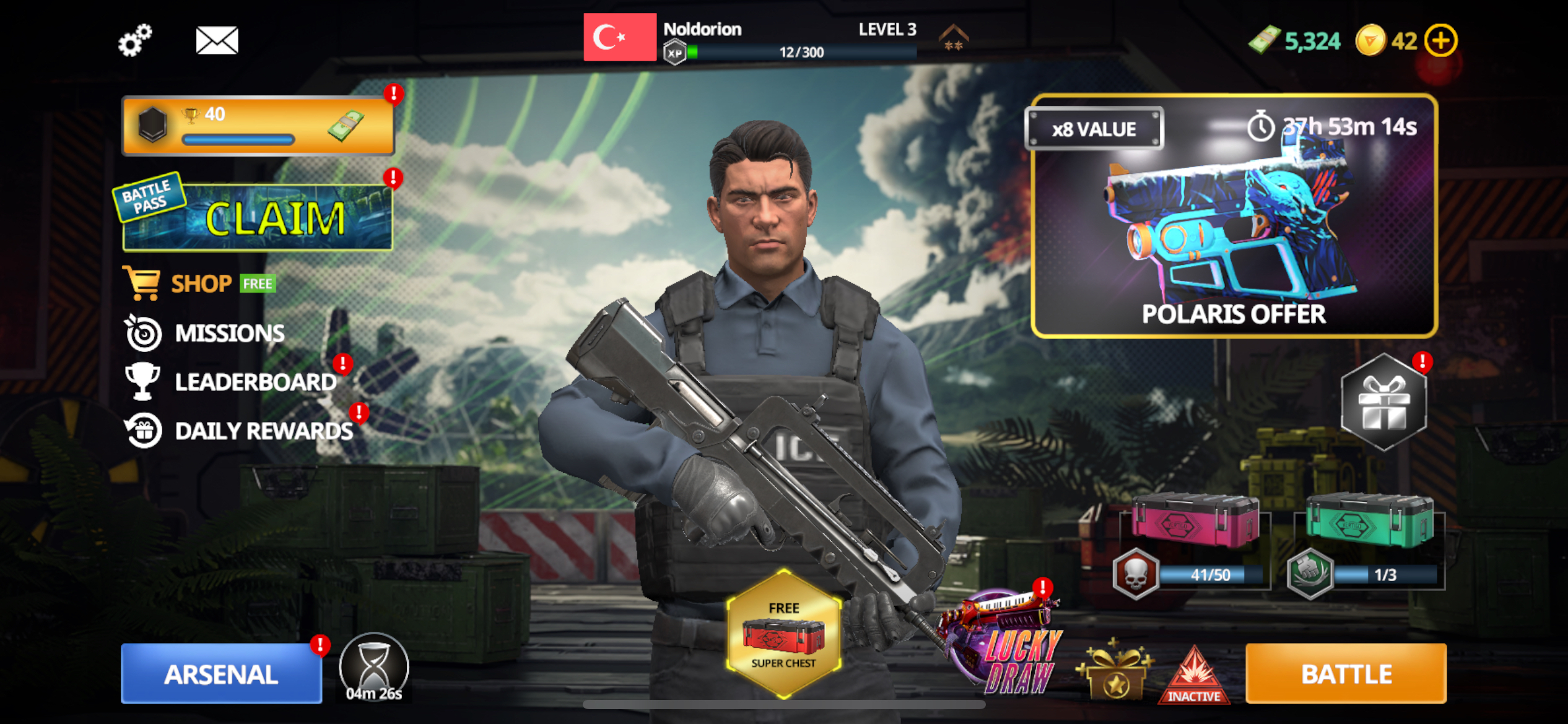
Main Screen
Studying this main screen from Critical Strike, I spotted a few problems:
The interface is too crowded, elements are disconnected, side menu needs a background, buttons need a “Pop!” and battlepass needs a bit more action.
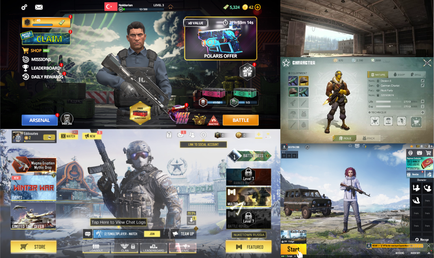
Other References
My redesign
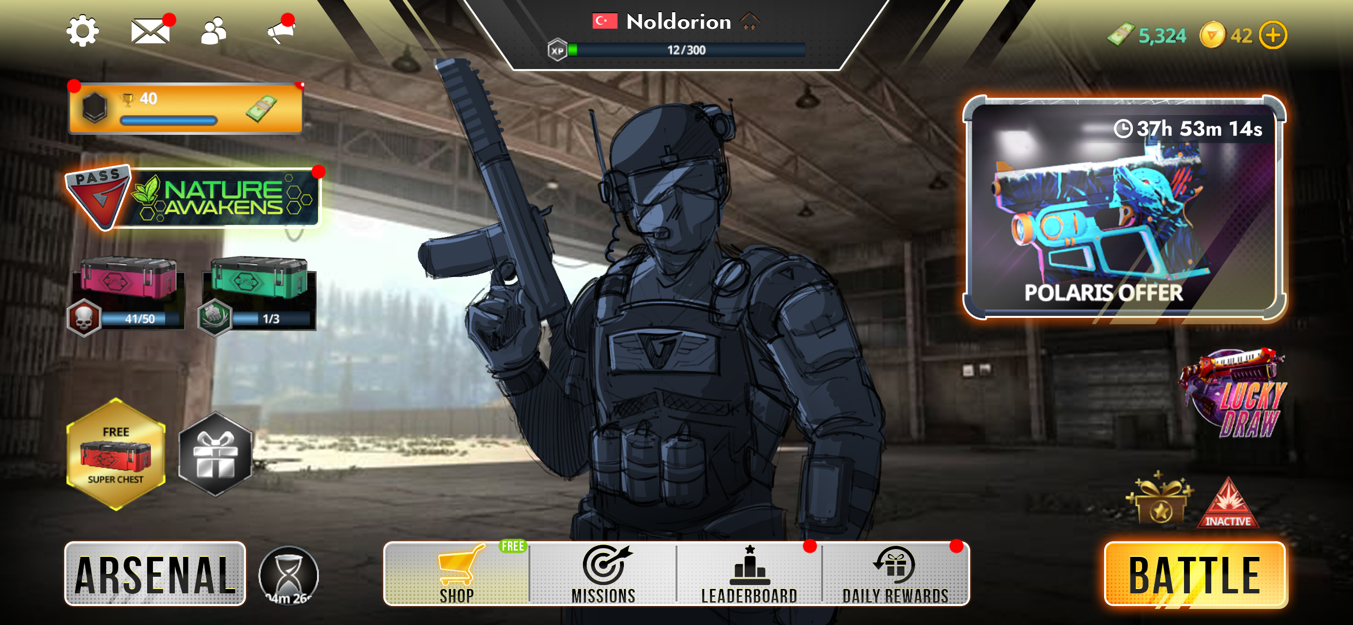
To solve the problems I spotted:
I rearrange the elements, Replaced and redesigned menu, designed a new Action/Battle button and a new icon for Battlepass.